Create Horizontal Navigation Menu With Drop Down Submenus Using CSS
This drop down menu made with CSS only is a horizontal menu with sub-tabs and a rounded search kafe on the right side. A menu like this can be handy for users who don't need complex menus or prefer not to use one that requires scripts and/or too many images. Also, the installation and customization is quite easy and, to top it off, it is quite functional.
To see this CSS drop down menu in action, please visit this demo blog

Before changing anything, if you are using a template available in Blogger Template Designer, then you should consider doing these changes in the template, otherwise the menu might not be displayed correctly:
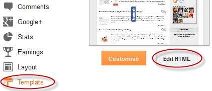
From the Blogger Dashboard, go to Template and press the "Edit HTML" button:
Search using CTRL + F for the following line:
Remove the code in red.
You may have many parts as the one in red, delete all you find.
....then find a similar annotation in your template:
Remove all the code you find after this annotation until you see the Headings part.
Then add this to where the code has been removed (instead of the code in green):
Step 1. From "Template", go to "Edit HTML" and just above ]]></b:skin> paste the following CSS code:

Step 2. After adding the code, click the "Save Template" button.
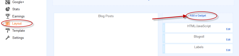
Step 3. Go to Layout > click on Add a Gadget link
Step 4. Choose "HTML/JavaScript" and paste the following HTML code inside the empty box:
- if you need more tabs, then add a line like this just above <!-- Search Bar -->
- if you want to add a tab with sub-tabs, then add this code:
- and if you want one of the other sub-tabs have sub-tabs then remove a line like the one in orange and change it to a code like this:
And that's it... Now "Save" your Widget and enjoy this new CSS drop down menu!
To see this CSS drop down menu in action, please visit this demo blog
Before changing anything, if you are using a template available in Blogger Template Designer, then you should consider doing these changes in the template, otherwise the menu might not be displayed correctly:
From the Blogger Dashboard, go to Template and press the "Edit HTML" button:
Search using CTRL + F for the following line:
<b:section class='tabs' id='crosscol' maxwidgets='1' showaddelement='yes'>
 |
| Screenshot |
Remove the code in red.
You may have many parts as the one in red, delete all you find.
....then find a similar annotation in your template:
/* Tabs
----------------------------------------------- */
Remove all the code you find after this annotation until you see the Headings part.
/* Tabs
----------------------------------------------- */
.tabs-outer {
overflow: hidden;
position: relative;
background: $(tabs.background.color) $(tabs.background.gradient) repeat scroll 0 0;
}
#layout .tabs-outer {
overflow: visible;
}
.tabs-cap-top, .tabs-cap-bottom {
position: absolute;
width: 100%;
border-top: 1px solid $(tabs.border.color);
}
.tabs-cap-bottom {
bottom: 0;
}
.tabs-inner .widget li a {
display: inline-block;
margin: 0;
padding: .6em 1.5em;
font: $(tabs.font);
color: $(tabs.text.color);
border-top: 1px solid $(tabs.border.color);
border-bottom: 1px solid $(tabs.border.color);
border-$startSide: 1px solid $(tabs.border.color);
}
.tabs-inner .widget li:last-child a {
border-$endSide: 1px solid $(tabs.border.color);
}
.tabs-inner .widget li.selected a, .tabs-inner .widget li a:hover {
background: $(tabs.selected.background.color) $(tabs.background.gradient) repeat-x scroll 0 -100px;
color: $(tabs.selected.text.color);
}
/* Headings
----------------------------------------------- */
Then add this to where the code has been removed (instead of the code in green):
#crosscol ul {z-index: 200; padding:0 !important;}After doing this, we can finally add our menu.
#crosscol li:hover {position:relative;}
#crosscol ul li {padding:0 !important;}
.tabs-outer {z-index:1;}
.tabs .widget ul, .tabs .widget ul {overflow: visible;}
How To Add CSS Horizontal Drop Down Menu to Blogger
To add the CSS horizontal menu with submenus in your blog, follow the next steps:Step 1. From "Template", go to "Edit HTML" and just above ]]></b:skin> paste the following CSS code:
/* Horizontal drop down menu
----------------------------------------------- */
#menuWrapper {
width:100%; /* Menu width */
height:35px;
padding-left:14px;
background:#333; /* Background color */
border-radius: 10px;
}
.menu {
padding:0;
margin:0;
list-style:none;
height:35px;
position:relative;
z-index:5;
font-family:arial, verdana, sans-serif;
}
.menu li:hover li a {
background:none;
}
.menu li.top {display:block; float:left;}
.menu li a.top_link {
display:block;
float:left;
height:35px;
line-height:34px;
color:#ccc;
text-decoration:none;
font-family:"Verdana", sans-serif;
font-size:12px; /* Font size */
font-weight:bold;
padding:0 0 0 12px;
cursor:pointer;
}
.menu li a.top_link span {
float:left;
display:block;
padding:0 24px 0 12px;
height:35px;
}
.menu li a.top_link span.down {
float:left;
display:block;
padding:0 24px 0 12px;
height:35px;
}
.menu li a.top_link:hover, .menu li:hover > a.top_link {color:#fff; }
.menu li:hover {position:relative; z-index:2;}
.menu ul,
.menu li:hover ul ul,
.menu li:hover ul li:hover ul ul,
.menu li:hover ul li:hover ul li:hover ul ul,
.menu li:hover ul li:hover ul li:hover ul li:hover ul ul
{position:absolute; left:-9999px; top:-9999px; width:0; height:0; margin:0; padding:0; list-style:none;}
.menu li:hover ul.sub {
left:0;
top:35px;
background:#333; /* Submenu background color */
padding:3px;
white-space:nowrap;
width:200px;
height:auto;
z-index:3;
}
.menu li:hover ul.sub li {
display:block;
height:30px;
position:relative;
float:left;
width:200px;
font-weight:normal;
}
.menu li:hover ul.sub li a{
display:block;
height:30px;
width:200px;
line-height:30px;
text-indent:5px;
color:#ccc;
text-decoration:none;
}
.menu li ul.sub li a.fly {
/* Submenu Background Color */
background:#333 url(https://blogger.googleusercontent.com/img/b/R29vZ2xl/AVvXsEgTWLVhXgahiMwznKZvwv-EXa8_7FSAMBhrVCwr2wilmHHWgh38p80dQarYE9ZOOzvryK1C0bh8M95T2SLYnG33fvT2UFJyZZ76MDgoNkuo9EgiOlMzig3KYEGKlnP-dwl8CnB3nFotaHI/s1600/arrow_over.gif) 185px 10px no-repeat;}
.menu li:hover ul.sub li a:hover {
background:#515151; /* Background Color on mouseover */
color:#fff;
}
.menu li:hover ul.sub li a.fly:hover, .menu li:hover ul li:hover > a.fly {
/* Background on Mouseover */
background:#646464 url(https://blogger.googleusercontent.com/img/b/R29vZ2xl/AVvXsEgTWLVhXgahiMwznKZvwv-EXa8_7FSAMBhrVCwr2wilmHHWgh38p80dQarYE9ZOOzvryK1C0bh8M95T2SLYnG33fvT2UFJyZZ76MDgoNkuo9EgiOlMzig3KYEGKlnP-dwl8CnB3nFotaHI/s1600/arrow_over.gif) 185px 10px no-repeat; color:#fff;}
.menu li:hover ul li:hover ul,
.menu li:hover ul li:hover ul li:hover ul,
.menu li:hover ul li:hover ul li:hover ul li:hover ul,
.menu li:hover ul li:hover ul li:hover ul li:hover ul li:hover ul {
left:200px;
top:-4px;
background: #333; /* Background Color of the Submenu */
padding:3px;
white-space:nowrap;
width:200px;
z-index:4;
height:auto;
}
#search {
width: 228px; /* Width of the Search Box */
height: 50px;
float: right;
z-index: 2;
text-align: center;
margin-top: 5px;
margin-right: 6px;
/* Background of the Search Box */
background: url(https://blogger.googleusercontent.com/img/b/R29vZ2xl/AVvXsEg3jyUhyphenhyphene0ijnfJrdSMhNIj-3tf_t5cKk-Y6k5UjS90HqPzXD8FdgA1wyaUhkb3MKx_-j13YTRXFjOlyr9MoKhPnh46hGbLecsUZEoeCm_4HSqfgHgpb3Pmwmg1fPgDhC7Cq9MqCVFReqs/s1600/searchBar1.png) no-repeat;
}
#search-box {
margin-top: 3px;
border:0px;
background: transparent;
text-align:center;
}
 |
| Screenshot |
Step 3. Go to Layout > click on Add a Gadget link
Step 4. Choose "HTML/JavaScript" and paste the following HTML code inside the empty box:
<div id='menuWrapper'>
<ul class='menu'>
<li class='top'><a class='top_link' href='Link URL'><span>Title 1</span></a></li>
<li class='top'><a class='top_link' href='Link URL'><span class='down'>Title 2</span></a><ul class='sub'><li><a class='fly' href='Link URL'>Submenu 2.1</a><ul>
<li><a href='Link URL'>Submenu 2.1.1</a></li>
<li><a href='Link URL'>Submenu 2.1.2</a></li>
<li><a href='Link URL'>Submenu 2.1.3</a></li>
</ul>
</li>
<li class='mid'><a class='fly' href='Link URL'>Submenu 2.2</a>
<ul>
<li><a href='Link URL'>Submenu 2.2.1</a></li>
<li><a href='Link URL'>Submenu 2.2.2</a></li>
<li><a href='Link URL'>Submenu 2.2.3</a></li>
<li><a class='fly' href='Link URL'>Submenu 2.2.4</a>
<ul>
<li><a href='Link URL'>Submenu 2.2.4.1</a></li>
<li><a href='Link URL'>Submenu 2.2.4.2</a></li>
<li><a href='Link URL'>Submenu 2.2.4.3</a></li>
</ul>
</li>
<li><a href='Link URL'>Submenu 2.2.5</a></li>
<li><a class='fly' href='Link URL'>Submenu 2.2.6</a>
<ul>
<li><a href='Link URL'>Submenu 2.2.6.1</a></li>
<li><a href='Link URL'>Submenu 2.2.6.2</a></li>
</ul>
</li>
</ul>
</li>
<li><a href='Link URL'>Submenu 2.3</a></li>
<li><a href='Link URL'>Submenu 2.4</a></li>
<li><a href='Link URL'>Submenu 2.5</a></li>
</ul>
</li>
<li class='top'><a class='top_link' href='Link URL'><span class='down'>Title 3</span></a>
<ul class='sub'>
<li><a href='Link URL'>Submenu 3.1</a></li>
<li><a href='Link URL'>Submenu 3.2</a></li>
<li><a href='Link URL'>Submenu 3.3</a></li>
<li><a href='Link URL'>Submenu 3.4</a></li>
</ul>
</li>
<li class='top'><a class='top_link' href='Link URL'><span class='down'>Title 4</span></a>
<ul class='sub'>
<li><a href='Link URL'>Submenu 4.1</a></li>
<li><a class='fly' href='Link URL'>Submenu 4.2</a>
<ul>
<li><a href='Link URL'>Submenu 4.2.1</a></li>
<li><a href='Link URL'>Submenu 4.2.2</a></li>
<li><a href='Link URL'>Submenu 4.2.3</a></li>
<li><a href='Link URL'>Submenu 4.2.4</a></li>
<li><a href='Link URL'>Submenu 4.2.5</a></li>
<li><a href='Link URL'>Submenu 4.2.6</a></li>
</ul>
</li>
<li><a href='Link URL'>Submenu 4.3</a></li>
<li><a href='Link URL'>Submenu 4.4</a></li>
<li><a href='Link URL'>Submenu 4.5</a></li>
<li><a href='Link URL'>Submenu 4.6</a></li>
</ul>
</li>
<li class='top'><a class='top_link' href='Link URL'><span class='down'>Title 5</span></a>
<ul class='sub'>
<li><a href='Link URL'>Submenu 5.1</a></li>
<li><a href='Link URL'>Submenu 5.2</a></li>
<li><a href='Link URL'>Submenu 5.3</a></li>
</ul>
</li>
<!-- Search Bar -->
<li>
<form action='/search' id='search' method='get' name='searchForm' style='display:inline;'>
<input id='search-box' name='q' onblur='if (this.value == "") this.value = "Search here...";' onfocus='if (this.value == "Search here...") this.value = "";' size='28' type='text' value='Search here...'/></form>
</li>
</ul>
</div>
How to Customize the Navigation Menu
- replace the text in blue and red with your links and titles.- if you need more tabs, then add a line like this just above <!-- Search Bar -->
<li class="top"><a href="Link URL" class="top_link"><span>Title</span></a></li>
- if you want to add a tab with sub-tabs, then add this code:
<li class="top"><a href="Link URL" class="top_link"><span class="down">Title</span></a>
<ul class="sub">
<li><a href="Link URL">Submenu Title</a></li>
<li><a href="Link URL">Submenu Title</a></li>
<li><a href="Link URL">Submenu Title</a></li>
</ul>
</li>
- and if you want one of the other sub-tabs have sub-tabs then remove a line like the one in orange and change it to a code like this:
<li><a href="Link URL" class="fly">Submenu Title</a>
<ul>
<li><a href="Link URL">Other Submenu</a></li>
<li><a href="Link URL">Other Submenu</a></li>
<li><a href="Link URL">Other Submenu</a></li>
</ul>
</li>
And that's it... Now "Save" your Widget and enjoy this new CSS drop down menu!
0 Response to "Create Horizontal Navigation Menu With Drop Down Submenus Using CSS"
Post a Comment