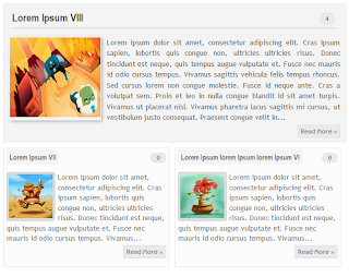
How to Create Magazine Style with Post Summaries and Thumbnails on Blogger
The magazine or newspaper style templates are those that display the posts summaries in the homepage by stacking the columns on top of each other. These kinds of templates are very popular nowadays, and whether it is a news or technology blog, everyone needs a fresh magazine style layout for their blogs.
There are several ways to make posts appear this way. An option would be to use the Read more script to display a summary of the posts and add a conditional tag to add a different style on the first post so that it will have a larger width than the older posts. So, this tutorial will show you how to create a magazine style for a Blogger Template. By following this tutorial, you can make your boring and simple Blogger template have an attractive magazine style layout.

To see how it looks, please visit this demo blog.

Step 2. Click anywhere inside the code area and search by using CTRL + F keys for this line:
Step 3. Remove that line and instead of it add this code:
Step 4. Now find (CTRL + F) this line:
Step 6. Find the </head> tag and paste the following script before/above it:
To change the width and height, respectively the size for the first post container, look for these lines:
Finally, set the number of posts to show on the homepage, so that there won't be any empty space. Go to Settings > Posts and comments > Show at most and select the number of posts that you want to appear.
There are several ways to make posts appear this way. An option would be to use the Read more script to display a summary of the posts and add a conditional tag to add a different style on the first post so that it will have a larger width than the older posts. So, this tutorial will show you how to create a magazine style for a Blogger Template. By following this tutorial, you can make your boring and simple Blogger template have an attractive magazine style layout.

To see how it looks, please visit this demo blog.
Adding the Magazine/Newspaper style to a Blogger Template
Step 1. Before proceeding further, please make a backup of your current template to make sure that you won't lose anything important - log into your Blogger Dashboard and go to Template, then click on the Backup/Restore button. After you've got a copy of the xml template, click on the Edit HTML button:
Step 2. Click anywhere inside the code area and search by using CTRL + F keys for this line:
<data:post.body/>Note: You'll find it more than one time, but stop at the second one in order to see the changes.
Step 3. Remove that line and instead of it add this code:
<b:if cond='data:blog.pageType != "item"'>Note: you can replace the Read More text, by changing the code in red.
<b:if cond='data:blog.pageType != "static_page"'>
<span class='post-comment-link'><b:if cond='data:blog.pageType != "item"'><b:if cond='data:post.allowComments'><a class='comment-link' expr:href='data:post.addCommentUrl' expr:onclick='data:post.addCommentOnclick'><data:post.numComments/></a></b:if></b:if></span>
<div expr:id='"summary" + data:post.id'><data:post.body/></div>
<script type='text/javascript'>createSummaryAndThumb("summary<data:post.id/>");</script>
<span class='readmorebutton' style='float:right'><a expr:href='data:post.url'>Read More »</a></span></b:if></b:if>
<b:if cond='data:blog.pageType == "item"'><data:post.body/></b:if>
<b:if cond='data:blog.pageType == "static_page"'><data:post.body/></b:if>
Step 4. Now find (CTRL + F) this line:
<b:include data='post' name='post'/>Step 5. Remove this as well and instead of it add this:
<b:if cond='data:post.isFirstPost'>Note: you can change the Read More text here also, just replace the code in red with the text that you want to show.
<b:if cond='data:blog.homepageUrl == data:blog.url'>
<div id='first'>
<b:if cond='data:post.title'>
<h3 class='post-title entry-title'>
<b:if cond='data:post.link'>
<a expr:href='data:post.link'><data:post.title/></a>
<b:else/>
<b:if cond='data:post.url'>
<a expr:href='data:post.url'><data:post.title/></a>
<b:else/>
<data:post.title/>
</b:if>
</b:if>
</h3>
</b:if>
<div class='first-body'>
<b:if cond='data:blog.pageType != "item"'>
<b:if cond='data:blog.pageType != "static_page"'>
<div expr:id='"summary1" + data:post.id'><data:post.body/></div>
<script type='text/javascript'>createSummaryAndThumb1("summary1<data:post.id/>");</script>
<span class='post-comment-link'><b:if cond='data:blog.pageType != "item"'><b:if cond='data:post.allowComments'><a class='comment-link' expr:href='data:post.addCommentUrl' expr:onclick='data:post.addCommentOnclick'><data:post.numComments/></a></b:if></b:if></span>
<span class='readmorebutton' style='float:right'><a expr:href='data:post.url'>Read More »</a></span>
</b:if></b:if>
<b:if cond='data:blog.pageType == "item"'><data:post.body/></b:if>
<b:if cond='data:blog.pageType == "static_page"'><data:post.body/></b:if>
</div>
</div>
<b:else/>
<b:include data='post' name='post'/>
</b:if>
<b:else/>
<b:include data='post' name='post'/>
</b:if>
Step 6. Find the </head> tag and paste the following script before/above it:
<script type='text/javascript'>Step 7. And below the script above add the CSS styles:
posts_no_thumb_sum = 290;
posts_thumb_sum = 240;
img_thumb_height = 80;
img_thumb_width = 80;
first_no_thumb_sum = 580;
first_thumb_sum = 450;
img_thumb_height1 = 145;
img_thumb_width1 = 165;
</script>
<script type='text/javascript'>
//<![CDATA[
function removeHtmlTag(strx,chop){
if(strx.indexOf("<")!=-1)
{
var s = strx.split("<");
for(var i=0;i<s.length;i++){
if(s[i].indexOf(">")!=-1){
s[i] = s[i].substring(s[i].indexOf(">")+1,s[i].length);
}
}
strx = s.join("");
}
chop = (chop < strx.length-1) ? chop : strx.length-2;
while(strx.charAt(chop-1)!=' ' && strx.indexOf(' ',chop)!=-1) chop++;
strx = strx.substring(0,chop-1);
return strx+'...';
}
function createSummaryAndThumb(pID){
var div = document.getElementById(pID);
var imgtag = "";
var img = div.getElementsByTagName("img");
var summ = posts_no_thumb_sum;
if(img.length>=1) {
imgtag = '<span class="posts-thumb" style="float:left;"><img src="'+img[0].src+'" width="'+img_thumb_width+'px" height="'+img_thumb_height+'px"/></span>';
summ = posts_thumb_sum;
}
var summary = imgtag + '<div class="summary">' + removeHtmlTag(div.innerHTML,summ) + '</div>';
div.innerHTML = summary;
}
function createSummaryAndThumb1(pID){
var div = document.getElementById(pID);
var imgtag = "";
var img = div.getElementsByTagName("img");
var summ = first_no_thumb_sum;
if(img.length>=1) {
imgtag = '<span class="first-post-thumb" style="float:left;"><img src="'+img[0].src+'" width="'+img_thumb_width1+'px" height="'+img_thumb_height1+'px"/></span>';
summ = first_thumb_sum;
}
var summary1 = imgtag + '<div class="summary">' + removeHtmlTag(div.innerHTML,summ) + '</div>';
div.innerHTML = summary1;
}
//]]>
</script>
<b:if cond='data:blog.pageType != "static_page"'>
<b:if cond='data:blog.pageType != "item"'>
<style type='text/css'>
.first-post-thumb {
margin-right: 10px;
}
.summary {
height: 100%;
}
#first { /* Styles for the First Post Container */
width: auto;
height: 250px;
float: left;
margin-bottom: 10px;
background-color: #F4F4F4; /* background color for the first post */
border: 1px solid #E5E5E5; /* border for the first post */}
.first-body { /* Style for the First Post summary */
color: #545454;
font-size: 13px;
text-align: justify;
padding: 5px 10px;
line-height: 1.5em;
}
#first h3 a, #first h3 a:visited { /* Style for the First Post Title*/
border-bottom: 2px solid #DFDFDF;
color: #515151;
font-size: 20px;
display: block;
margin: 10px auto;
width: 95%;
font-size: 20px;
padding: 0px 0px 4px 0px;
font-weight: bold;
text-align: left;
line-height: 1.4em;
background: none;
}
#first h3 a:hover { /* Color on mouseover for the First Post Title */
color: #1061A1;
}
.post { /* Styles for the small posts container */
float: left;
margin: 0px 6px 2% 5px;
width: 46%;
height: 230px;
padding: 0px 5px 5px 5px;
background: #FCFCFC; /* background color for the small posts */
border: 1px solid #E5E5E5; /* border for the small posts */
overflow: hidden;
}
.posts-thumb { /* Style for the small posts thumbnails */
margin-right: 10px;
}
.post-body img, .post-body .tr-caption-container, .Profile img, .Image img, .BlogList .item-thumbnail img {
background: none;
border: none;
box-shadow: none;
padding: 0;
}
h3.post-title a{ /* Style for the small posts titles */
font-size: 14px;
color: #747474;
text-transform: uppercase;
}
h2.date-header { /* Hide the post date */
display: none;
}
.post-footer {
display: none;
}
h3.post-title {
margin: 0px;
}
.readmorebutton {
margin-top: 5px;
}
.readmorebutton a { /* Styles for the Read More link */
color: #767676;
border: 1px solid #E1E1E1;
background: #EAEAEA; /* Background color for the Read More link */
text-decoration: none;
padding: 3px 5px;
font-weight: bold;
font-size: 11px;
float: right;
position: relative;
}
.post-comment-link { /* Style for the comment bubble of posts below */
position: absolute;
top: -35px;
right: -10px;
display: block;
border: 1px solid #E1E1E1; /* border for the comment bubble */
background: #EAEAEA; /* background color for the comment bubble */
font-size: 11px;
position: absolute;
}
#first .post-comment-link { /* Style for the comment bubble of first post */
position: absolute;
top: 10px;
right: 0px;
}
.post-comment-link a { /* Link color for the comments bubble*/
padding: 10px;
color: #6A6A6A;
text-decoration: none;
font-weight: bold;
}
#blog-pager {
clear: both;
}
</style>
</b:if>
</b:if>
Customizing the Magazine Layout
1. At the beginning of the script from step 6, we have this section:posts_no_thumb_sum = 290;
posts_thumb_sum = 240;
img_thumb_height = 80;
img_thumb_width = 80;
first_no_thumb_sum = 580;
first_thumb_sum = 450;
img_thumb_height1 = 145;
img_thumb_width1 = 165;
- the first number is the number of characters for the small posts when there will be no image available
- the 2nd number is the number of characters that will show when the small posts will have an image
- the 3rd and the 4th line is for the height and width of the small posts thumbnails (images).
- the same goes for what is in blue, but this affects only the first post. Since the first post is wider, it may contain a larger number of characters and we'll be able to make the thumbnail size larger.
To change the width and height, respectively the size for the first post container, look for these lines:
width: auto;Underneath the first post are the values for the other posts, just look for this part:
height: 250px;
width: 46%;The width will ocuppy 46% of the main column width and height is set to 230px. Here you may need to experiment a bit with the sizes in order to make them appear correctly.
height: 230px;
Finally, set the number of posts to show on the homepage, so that there won't be any empty space. Go to Settings > Posts and comments > Show at most and select the number of posts that you want to appear.
0 Response to "How to Create Magazine Style with Post Summaries and Thumbnails on Blogger"
Post a Comment